
אולמי אופרה
מתחם אירועים יוקרתי הממוקם בלב נהריה, המתחם כולל שני אולמות מעוצבים בסגנון מודרני, המאובזרים במערכות תאורה והגברה מתקדמות
כל העסקים
מתחם אירועים יוקרתי הממוקם בלב נהריה, המתחם כולל שני אולמות מעוצבים בסגנון מודרני, המאובזרים במערכות תאורה והגברה מתקדמות

רוטשילד לופט הוא מתחם אירועים יוקרתי ומותאם למגוון רחב של אירועים ומסיבות, כולל ימי הולדת, מסיבות רווקים/רווקות, בר/בת מצווה, חינות, וכו

מתחם אירועים יוקרתי בחיפה, המתחם משלב אולם שקוף וממוזג עם מרפסת דק עץ הפונה ישירות לים, ומציע חוויה ייחודית לאירועים פרטיים ועסקיים.

מגורים ומלונאות הממוקם על חוף הים בחיפה, בכניסה הדרומית לעיר. המתחם כולל שני מגדלים: מגדל "אלמוג" ומגדל "שחף", אשר שימשו בעבר כמלון מרידיאן. כיום,
")
שכונת דניה בחיפה נחשבת לאחת השכונות היוקרתיות בעיר, ומאופיינת בווילות מפוארות ונוף מרהיב. המחירים בשכונה זו משקפים את יוקרתה,

המרפאה מציעה מגוון רחב של טיפולי שיניים, כולל אסתטיקה ושיקום הפה, רפואת שיניים לילדים, יישור שיניים, טיפולי שורש ושתלים, ושירותי שיננית.
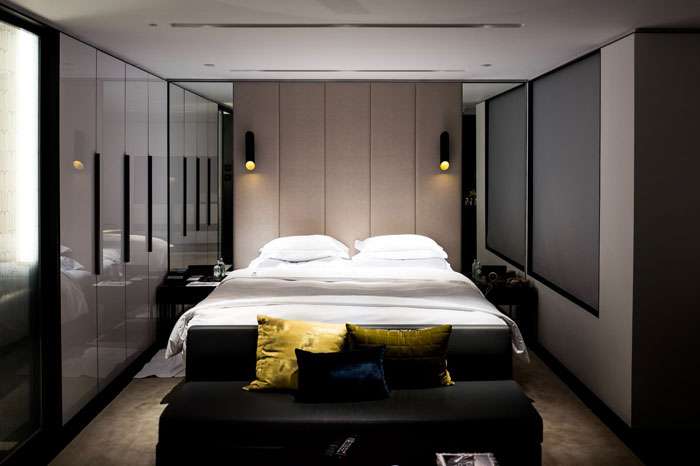
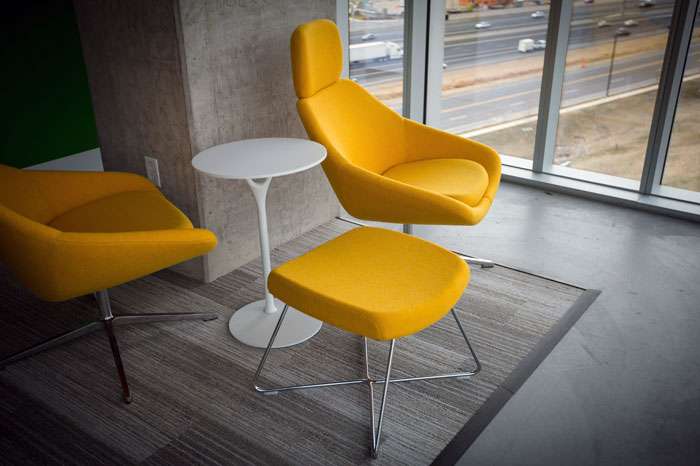
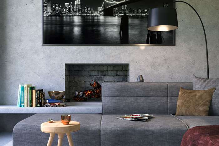
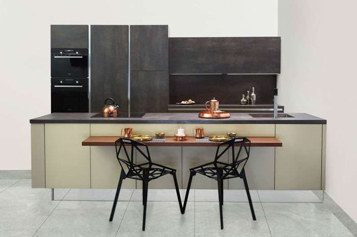
Our Portfolio
Testimonials
"You guys are legendary! You guys are great and having amazing support & service. I couldn’t ask for any better. Thank you!"

"You guys are legendary! You guys are great and having amazing support & service. I couldn’t ask for any better. Thank you!"

"You guys are legendary! You guys are great and having amazing support & service. I couldn’t ask for any better. Thank you!"
Recent Updates

